12.29.2005

Ava Thursday: Little Girl


A simple drawing of a little girl drawn by my little girl. Ava wishes everyone a Happy New Year!

------------------------

Currently on hiatus with the family. I plan on writing some sort of meager year-end wrap-up soon, so I'll try and concoct something witty for you all to revel in.

12.22.2005

Ava Thursday: Merry Christmas!


Ava is SO into Christmas, and, believe it or not, just loves the whole gift-giving aspect of the season. Kids normally gravitate to the gift-getting part, but Ava's never really focused on wanting too many things for Christmas. It's a bit strange, but I'm not going to complain. It'll probably change the older she gets, but hey, we might as well enjoy it now when we can. (And I have to mention this beautiful post by Andrea on Ava's recent act of Christmas benevolence.)

So here we have a wonderfully cheerful Christmas scene, complete with Santa, a Christmas tree and kids. I like that Ava has drawn the Big Red Guy in full stride, in motion, with gifts in his hands. There really isn't that much of a story here, but Ava did say that the boy on the left is surprised to not find any gifts for him. I'm assuming that Santa is trying to get there in time to give the boy his presents, but since I'm not the artist, I won't know for sure. The girl to the right is not Ava -- I'm wanting to assume that Ava draws herself in almost all her drawings, but apparently that's not always the case.

A nice touch is the half-eaten carrot for the reindeer on the table there.

Ava also drew a scene on the backside of this picture, and so I thought I'd share that one as well:


Ava tells me that this is a girl who was surprised by something and that she's dropping a doll. You can see the motion lines right where the doll is. I like how she tried something different here by drawing a large profile, with a very detailed eye. It looks to me that Ava was really working on more detail in this picture than usual. That's a toybox over on the left, and "Toe" is Ava's way of writing out "Toys" phoenetically. With her learning to read and write, we were told that it's good for Ava to try and write out what she thinks the word is by mouthing it out and to listen to how it sounds, but not to correct her too much.

As usual, to view these images closer, click on them and you will be taken to their Flickr page. From there, click on "All sizes."

----------------------

Well, if I don't see you guys before then, I want to take the time to wish you all a very Merry Christmas and a very Happy New Year! From the Jenkins Family to yours, best wishes for the Holidays.

12.18.2005

1956 Decorating Book


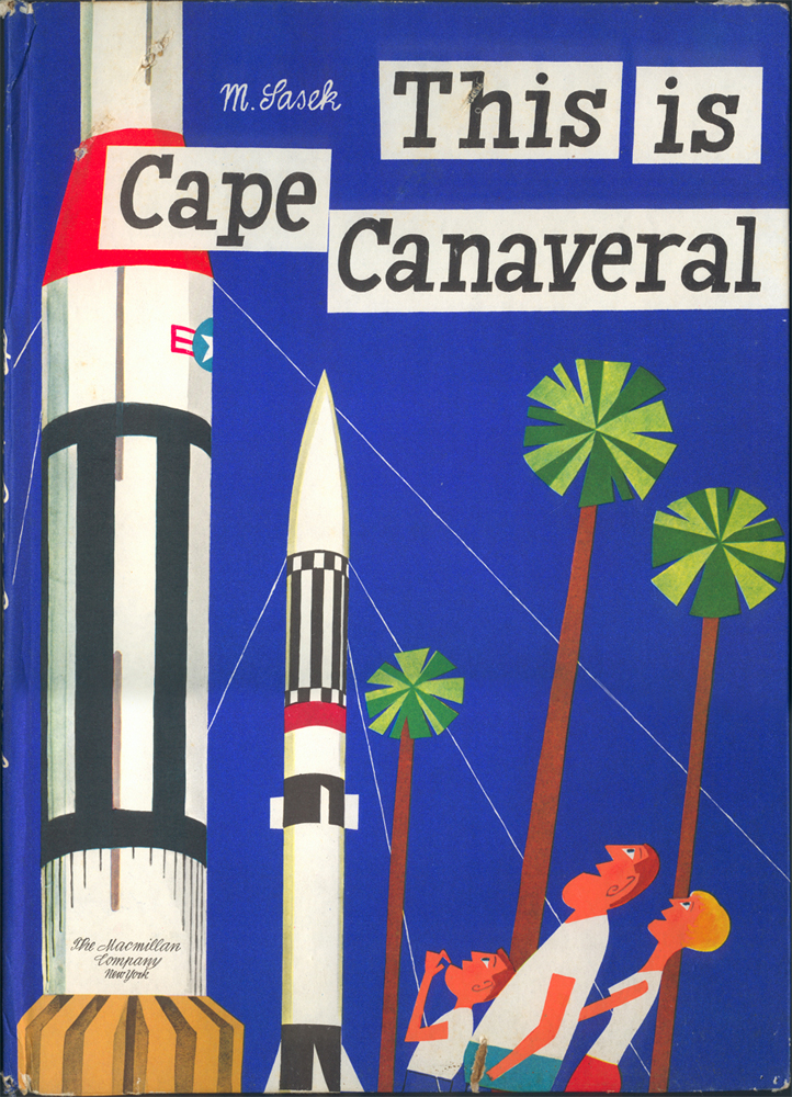
Check these illustrations out from the Better Homes & Gardens Decorating Book, 1956 edition. I got it off of eBay when a saw a co-worker's copy on her desk at work. She had an edition with a nicely illustrated cloth-bound cover, but the version I have has a simple turquoise cover. No biggie, as all I really wanted were the great series of illustrations found on all the chapter dividers. Wonderful yet simple stylized characters done in a two-color process, very typical of spot illustrations at that time. The sad thing is, however is that there is absolutely no credit given to the artist. I searched throughout the entire book but couldn't find anything. It's a shame, really.

UPDATE: Mystery solved!

One thing I find interesting, the photos of rooms throughout the book gives us a great insight into what was happening in home decorating at that time. Of course, all the rooms shown were more of an idealized version of the plain-jane reality that was probably true to the typical modern home of 1956, but it is still fascinating to see what trends were strong, what colors were in vogue, what furniture styles were big while thumbing through this book.

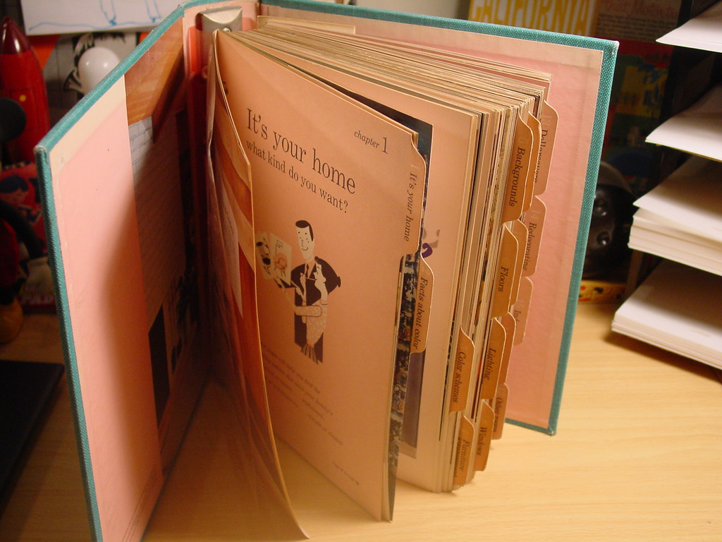
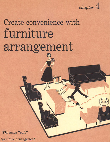
But it's all about the illustrations for me. The book is actually a five-ring bound notebook sectioned off into chapters, with sturdy paper dividers tabbed for easy access. It is on these dividers where these fun illustrations reside. The characters are simple, but effective in telling the story for each chapter topic, whether it be for choosing color schemes, glamorizing your floors, or lighting up your rooms with the right lamp. I would have to say that the images are deceptively simple because the more I look at them, I begin to see just how sophisticated the artist was in executing each scenario. The layout, the placement of the furniture, the poses of all the characters are done with finesse.

I'm posting just a few of the illustrations here, but I have the entire set scanned and put together in a Flickr photoset. You can check them all out HERE.


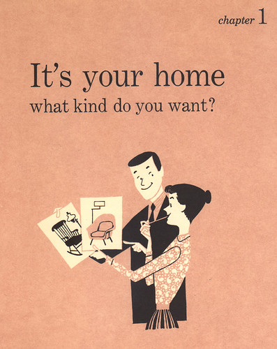
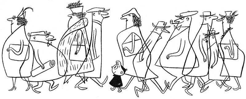
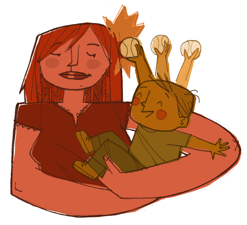
Notice here that the two choices of chairs the wife is holding up represent the two major decorating styles of choice that were at issue at the time: Conventional and Modern. (In this book, they describe the two styles as Colonial and Contemporary, but I've seen several variations on these themes, and they all pretty much mean the same thing.) A slight generalization here, I'm sure, because there were many, many other decorating styles that popped up around that time. But from what I've seen and read in many home decorating magazines and the like (including this particular book), a good many articles focused on talking, discussing and debating about these two opposing decorating patterns: which one was best for your home, the pros and cons of each, how to mix and match to make every family member happy, etc. It's a very fascinating thing to read and look back on.


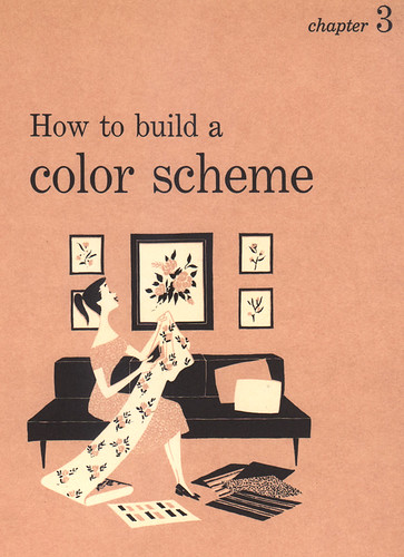
The above two pages showcase the artist's great sense of positive and negative space, giving off the impression that there's more to the illos than the limited use of two spot colors, white and black. By incorporating the background color of pink, a third color can be implemented. Looks easy, but it is very difficult to pull this off, believe me. There's this uncontrollable urge to draw everything out in black line and then fill in with white, because that comes natural to any artist. It's what we've been doing since we could pick up a crayon. There's more thinking that goes into illustrations like these, and in order to make it look so easy without any hitches -- well, that's the sign of a great artist.

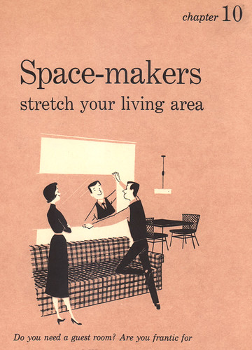
Oh, and I have to say that the standing pose the woman hits in Chapter 10 is brilliant. There's a great sense of weight and proportion to her that is just perfect. The artist did a great job in conveying her standing with weight shifted over to the side, contrapostal, I believe.


The artist was a great draftsman, too. Look at the layout and overall design of this room. Thre's some nice stuff going on in here. I especially love how the woman is definitely in charge here. Looks like she's really getting into it!


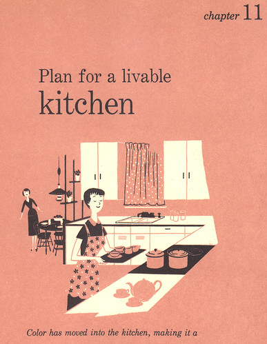
Yes, she's in the kitchen, but now with style.

Again, to see the rest of the images from this set, check them out HERE.

-------------

Like I've mentioned before, I'm currently painting a mural for Victory Vintage Home, in Decatur. I approached the owner, Lee, about perhaps enlivening up the back wall behind her store because she had this area that was simply perfect for a mural -- not too big, not too small. Plus, it's right next to a main road, with many cars passing by, most of which will be stopped because of the traffic light right there where the store is. Perfect opportunity for adding on to what the store is all about.

Instead of doing something original, I thought it would be a great idea to incorporate, or rather, reuse illustrations from the Decorating Book and duplicate them for the wall. Since Victory Vintage sells furniture and items from the 40's to the 70's, and most of what Lee sells is modern by design, these illustrations were perfect! When I showed her my proposal with the images photoshopped over photos of her back wall, Lee just about flipped.

It's been an interesting thing to duplicate large up on a wall what was originally meant to be viewed in a smaller scale like a book. The images so far transpire really well. Bold lines and color help. It's taking me a while to work on it -- finding time outside of work and family business is very rare and fleeting -- so BIG props to Lee for being so patient with me in all this. I'm having a blast with it so far -- that is, when I do manage to eek out the time to paint. If anyone in the area would like to check it out, stop by the store at 303 E. College Avenue, just across from Agnes Scott College.

Some details about the mural:

I picked out three images to use for the Victory wall, most of which will remain unchanged, but with a few alterations to fit for space. Here's what I chose:


This scene will be virtually unchanged.


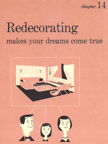
I love the floating heads of the family here, so they will be in the middle of the mural. Plus, I'll be painting "Redecorating: making your dreams come true" right above them.


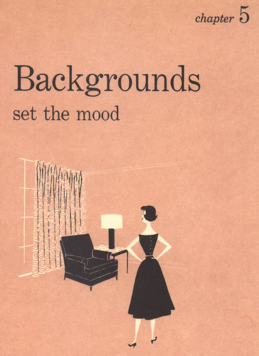
This part will be at the far right of the wall, with the woman moved a bit to utilize the space better.

And here's part of the wall so far. I've since added on to much of it, but this'll give you an idea of how it's coming along:


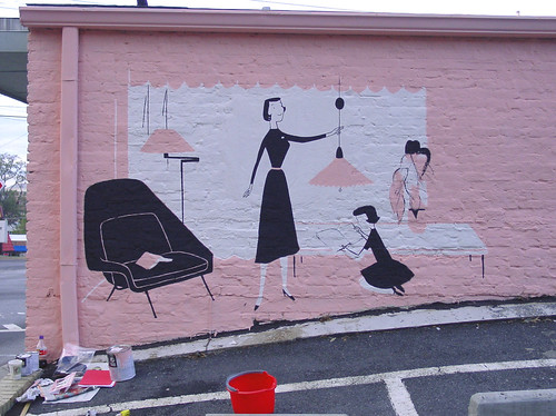
I added a nose to the mother there -- for some reason it looked better. I've finished the girl since this photo was taken.


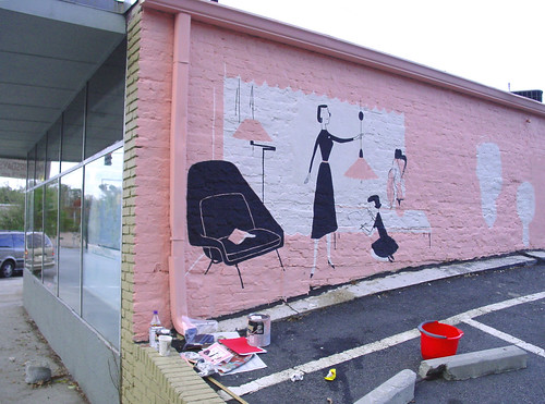
Another shot of the wall. You can see where I've painted the white for the family's heads in the distance there.

Try to stop by and check out the progress when you can! Offer me some hot coffee to warm my freezing bones -- it gets pretty cold and lonely in the back there.

12.15.2005

Ava Thursday: Ava at Work/The Rose on the Table

And now for something completely different! In an attempt to prove to you all that I do not ghost-draw for my 5 1/2 year-old daughter, Ava, I was able to capture her in the act of drawing her next masterpiece. Here's a series of shots of Ava at work, deep in thought, and drawing like a fiend. If you ever get the glorious opportunity to watch Ava draw, it's quite a sight. But of course, I'm her father, so I'm supposed to say that. Seriously, it is fascinating to watch her create something out of nothing, right before your very eyes. I'm not really sure if she has something in mind before she draws it, but I'm assuming that she does, because sometimes she draws pretty quick. No questions asked.


Ava contemplating her next move.


A bird's eye view of my girl at work.


Ava's POV. Feel the creativity! Feel the genius flowing through you!


She's now moved onto the character to the right.


Almost done. Now she'll fill in the color where needed.

And thus...


Here it is! All done for everyone to enjoy. Funny little story here. Ava tells me that this is some girl who is surprised by how the rose on the table has suddenly grown so tall, like a sunflower. She says that the girl didn't know that roses could grow like that!

The rose has grown so fast that it knocked down a drawing and some crayons to the floor. That's a rug underneath the table. On the right of the rose on the table is a cup of hot coffee (Ava's grandmother, Meemaw, drinks coffee).

I like how the girl is so surprised that her glasses have fallen off.

There ya go. Thought that you all might enjoy seeing the girl in action. As I was taking these shots, Ava pretty much remained quiet the whole time -- just sat there and did her thang. No questions, no problems. Focused and with her patented "quiet determination." I try my best not to get too up in her grill when it comes to stuff like this, but sometimes a parent can't help it -- sorry, but we have to. Yes, sometimes it's overwhelming for us to do that to our kids, but I can't help but think that moments like this will be fleeting and I'll never have that moment again.

So it's cameras in the faces of our kids all the way, baby.

As always, you can click on the images to see their Flickr page, and then click on "All sizes" to view larger.

12.13.2005

Ward Art for Your Celly


I'm very excited about this. You can now actually download official Ward Art for your phone! START Mobile is a service offering downloadable artwork from hundreds of artists for mobile phones. It's an extension of START SOMA, a San Francisco gallery for emerging artists, both being the brainchild of John Doffing. Recognize the name? You should. He was the one responsible for the Hotel Des Arts, a boutique 51 room hotel in San Fran, featuring entire rooms painted by many of these same emerging artists. It's a pretty cool thing he's doing here with his newest venture, the START Mobile, and one that could really take off. I'm greatly honored to be a featured artist. A wonderful opportunity for all the artists involved.

And, boy, talk about the artists! With the tagline Art for Everyone, Art for Everywhere, you can choose from an incredible roster of artists -- some well-known, some not (I fall into the latter catagory, I'm afraid). Check it: Shepard Fairey, Tim Biskup, Lynne Naylor, DAIM, Kirsten Ulve, fellow artist blogger Steve Mack, and many many more. You'll have to scroll down towards the bottom to find me, but that's okay. When you do, definitely download some art for yourself -- it's only $1.99 for each piece of digital goodness. Here's a shortcut to my page, but please be sure to check out all the other great artists featured. They some fine folks.

So, why did I choose the images you see in my gallery? I have to tell you, it was not easy. I had to take a big long think about it, and so with my secret weapon, Andrea, helping me make the final decsions, I knew that we chose wisely. I wanted bold, strong, colorful images that pop. The kind that might make a statement about the buyer. Ones that would look über-cool/nifty/spiffy.... so when you open up your celly to make that nightly bootycall, your friends would immediately ask, "Cool! Where'd ya get that?"

I hope you spendspendspend to your little heart's content! It's a great idea that has great potential. By the way, I plan to update with newer images from time to time, so be sure to check up on my page periodically. Also, if there is one image that you liked in particular that I do not have available for download, please let me know and I'll see what I can do.

Spend, oh great consumers, SPEND! (And yes, we artists do get a piece of the monetary pie, so you'll actually be supporting your favorite starving outcast. Thanks!)

Hope you enjoy!

12.11.2005

Beautiful


To Andrea, with whom I've shared the last 15 years of my life with (11 of which married): I thank the great God above for your birth into this world. More than I can depict with words, more than I can encapsulate in paint and canvas, your presence on this earth moves me to no end.

And that is why I continue with what I do. Your support in anything that my multi-faceted mind conjures up is indispensible. Thank you.

Happy Birthday, sweetie.

12.09.2005

Make it a Hip-Hop Christmas

Just in Time for Christmas
Click on image to view larger.

Occasionally I'll do some artwork for my brother-in-law, Nate (aka DJ DUST), for his hip-hop group Mars ILL. This year Nate decided to have a little fun by recording a Christmas album, so he paired up with fellow DeepSpace5'er, Listener, and thus, Just in Time for Christmas was born. To compliment the "fartin' around" attitude that the album seemed to take, Nate wanted to do something a little different from your typical yuletide cheery album cover art. What a better way to convey this than to have your average run-down hobo-like Santa taking a little listen to some beats on some funked-out super-MOOG? Makes sense to me.

To buy this hip-hop holiday extravaganza, click HERE. (Scroll down a bit.)

12.08.2005

Ava Thursday: Doggie in a Truck


To view larger, click on image to view it in Flickr. Then click "All sizes."

My mom came up some time ago and handed me this little yellow piece of paper that came from a notepad. "Here, I thought you might like to put this on 'Ava Thursday.' Ava drew this while in my car when she last came to visit me."

A doggie in a truck, with his tail wagging. Something so simple, yet so effective. This tells a story in one frame -- no other drawing is needed. A fun little doodle by a fun little 5 year-old girl.

I love how she drew the motion lines for the dog's tail, showing that it's wagging, and how his paws go over the side of the truck. Classic.

12.06.2005

Self Portrait Tuesday: Reflective


The theme for Self Portrait Tuesday this month is Reflective Surfaces. So here's a shot of me looking in the rear-view mirror while wifey goes into the one, the only Tar-zhay. That's Ezra in the back there, asleep. Poor widdle buddy.

Oh, and say hello to my new beard. This is it's big debut on The Ward-O-Matic.


Yes, it still itches.

12.05.2005

Some Visual Goodness

Just taking a breather from worky-work to clue you all in on some great stuff happening around the web:

My Flickr group, The Retro Kid has reached some milestones recently, most notably the 1000 image mark. We now are about to reach 300 members, too, which is simply amazing to me. Big thanks to all those responsible for scanning and preserving such wonderful artwork for kids from the 40's into the 60's.

Speaking of which, my co-hort in crime over at the Kid and the one with the most Kid submissions (currently at 244!), Eric Sturdevant has now started up his own blog, Fun All Around. Along with some of his own work, Eric will focus on a some illustration greats from that mid-century era. Be sure to check out his post on Leonard Weisgard. Excellent work, Eric.


More illustration news, previously blogged Leif Peng and his fantastic Today's Inspiration has now a blog home! With each TI post you now get more insight into the life and times of each featured illustration great -- many of which were stars in their own right back then but have been largely overlooked nowadays. It's a shame because it's so important to know your history and to give respect to your art/illustration/animation elders. Please check out Leif's Flickr, too, as he's been putting together wonderful photosets of some of these illo giants.

My good pal Amid Amidi has started up Cartoon Modern, in what has to be a first: a blog for a book. Actually, it's more like an addendum to his upcoming book on design in cartoons from the 50's. I'm such a geek for the book already, and it won't even be available until Spring of '06. It'll be worth the wait, I'm sure.


Just as it is important to know your history in illustration, so it goes with animation. And that's why Stephen Worth has started up the ASIFA-Hollywood Animation Archive blog. He just recently posted some more of Ray Patin Studios' work, thanks to Dan Goodsell of The Imaginary World. And speaking of Dan...

Dan has started up his own blog, too! Check out a sampler of things, featuring more of Dan's incredible collection of kid's food packaging as well as his own work. He's a big Retro Kid contributor, too. Check out more stuff on his Flickr.

More:

Nick Sung did a great review of TOOT WHISTLE PLUNK & BOOM on his blog, The Firehouse Stomp -- using images of the film that I grabbed and displayed for you all back in May. This is exactly why I posted those images: for discussion and analysis, to better articulate and observe great animation design, color and composition. I highly recommend others to do the same. The more discussion, the more awareness, and the more awareness, the better we all get as artists and animators. Thanks for the post, Nick!

Joel Trussell's scribbledumpster: excellent and fun characters and color from Joel, he of Cartoon Cockfight. He directed the wonderfully amazing War Photographer. Brilliant.

Okay, so this post when for FAR too long than I had hoped. But there's so much great stuff out there, I couldn't stop. Enjoy these great sites and blogs, and keep it up!

Some cool news coming soon. Stay tuned....

12.01.2005

Ava Thursday: My Birthday Card


Ava drew this for me for my birthday last week on Thanksgiving. Yes, that's me as a turkey. My own daughter drew me as a turkey -- funny, ain't it? It's funny, and I love it. So that's me holding hands with Ava who has a birthday card for her dear ol' dad. In my other hand is a present that I'm about to open. This scene is amazingly accurate from what transpired on that day, save for me being an actual turkey.

The "Happy Birthday" at the bottom there was done on another card that she drew for me, I just loved it so much I wanted to share that as well.

11.30.2005

Busy busy busy

It's the Holidays so that means madness at the malls and maniacal shoppers. It also means crazy deadlines and long hours at work. So, with that said, my time spent on updates and new posts will be dramatically reduced here on The Ward-O-Matic for the next couple of weeks. Ava Thursday will not be affected, of course, but posts for the most part will be few and far between. Very sorry for this, but I plan to have things back up to normal in a little while. Hope you all understand. I might post an image for inspiration, or whatever, but without any of my incessant ramblings. We'll see how it goes.

In the meantime, try to enjoy this time of the year. I try to, even when it gets this crazy.

11.28.2005

steel wheels


There's something about trains. The massive box cars gliding across wooden planks, rolling, lumbering, breathing like giant metal beasts. Hearing the brakes screech over the monotonous thump thump, thump thump is so exhilarating. Whenever I see a train I have to stop and watch. I love to see all the different types of cars, the various colors and rusty boxes -- I love to wonder where they've come from, where they're going. And an added bonus for me is to see all the wonderful splashes of color thanks to various steel heads within the graff community telling us who they are and where they're from. It is this rolling gallery of art on wheels that makes my day, even when I get caught at a train crossing.

I used to hate to wait at these crossings, but now I yearn for it.

11.25.2005

I wanna hear music from the 50's, daddy.

I was in the car with Ava the other night, driving around to get Ezra to fall asleep. Once the boy was out, I decided to put in the great sounds of They Might Be Giants, more specifically, their most recent album for kids, Here Come the ABC's. Right in the middle of it, there was a song titled, "Rolling O" that had a different sound to it. An older sound, you could say, with a Hammond organ and some horns. Ava perked up.

"Daddy, this song sounds like it's from the sick-tees." She fumbled with that last word.

"The what, sweetie?"

"The sicks-tees. You know, like how Buddy was a cool daddy-o." ("Buddy" is our nickname for Ezra, and she's referring to when Ezra was dressed up as a beatnik for Halloween. You can see what the kids looked like here, by the way.)

"The 60's? You mean it sounds like an old song?"

"Yeah."

I then agreed with her, that yes, this song does sound like it's an old song, even though it was made recently. I then decided to drop some knowledge on my precious little 5 year-old sponge (knowing full well that this might go over her head) and proceeded to tell her that a beatnik was actually from the 50's.

"I wanna hear music from the 50's, daddy," Ava pipes up almost suddenly. I look at her in my rear-view mirror, stunned.

"You do?" "Yeah."

My thumb couldn't spin around that click-wheel on our iPod fast enough, I tell ya. I mean, when do you ever get the chance to showcase some fabulous sounds of the 1950's to your daughter? Not very likely. Even though Ava and Ezra are exposed to a vast eclectic mix of music from Andrea and I both in the car and at home ranging from Múm, DJ Shadow, Zero 7, Sufjan Stevens, Ida, Mars ILL, as well as the aforementioned They Might Be Giants, it's quite unusual to get a request for a particular era of music. As I clicked and scrolled through my music collection, I realized that I did not have any of the early rock 'n roll tunes -- what you might call "rock standards." No biggie, though, as I had plenty for Ava to listen to.

A little bit of Dean Martin, a smidgen of Les Baxter, a dash of Bobby Darin ("Mack the Knife," natch), a pinch of Peggy Lee -- I went through a small smorgasbord of various sounds that came out during that time, and Ava was soaking it all in. She really seemed like she was enjoying herself, be-bopping in her car seat from song to song, moving to the beat. As I went through the calvacade of mid-century songs, Ava would ask during each song, "Is this from the 50's?" And I would answer "Yes," obediently, with a slight smile. I was intrigued by the fact that she seemed intent on knowing how a song from the 50's sounded. Once I exhausted my impromptu playlist, I started to play some songs off this fantastic collection called The Best ...And Friends Album In The World, a hard-to-find UK import which features music from the late 30's into the 70's (and somehow makes it fit together rather nicely, I might add). I played "The Lady Is A Tramp" by Lena Horne, from 1948. Again, from Ava: "Is this from the 50's?" "No, this is actually a little older, from the 40's, I think." Pause.

"What's a 'tramp'?"

Hmmm. What IS a tramp? And worse yet, how do you explain this to a 5 year-old girl? My mind raced with images of trashy women from that era, from those pulp novel covers, to Bettie Page -- at one point a 60's go-go dancer popped into my head for no apparent reason -- I had to think fast. Suddenly, it dawned on me.

"Well, you know Tramp from "Lady And the Tramp" right? Well, you remember that he's just a dog who doesn't have a home, who just goes around and tries to find friends, right"

"Um hmm," She agrees.

"That's what this woman is singing about: someone who doesn't have any friends and is going around trying to find some."

"Oh," Ava seemed to understand. I was off the hook! Goodness....

I then moved onto "What's New Pussycat?" by Tom Jones, thinking that Ava might dig the kitty-cat theme but overlook the subtle sexual overtones in the song. I kinda giggled to myself at how I got into that predicament, at how it's funny how kids look at the world around them with innocent eyes, and how we, as parents, tend to overlook certain terms and phrases that might seem tame but have dual meanings. I then began to think about my explanation to her, about what a "tramp" is. That is a rather nice way of putting it, if you think about it, yes? I almost made a 'tramp' a sympathetic character. Obviously in the Disney movie Tramp IS a sympathetic character, but in Ms. Horne's rendition, the 'tramp' is someone who is looked down upon for not going with the status quo. She's labeled a 'tramp' because she "won’t dish the dirt, with the rest of those broads." Interesting.

Anyway, since Ava's 50's music enlightenment that evening, I've since gathered some neato Elvis tunes and some various early rock 'n' roll standards, just so Ava will have a nice well-rounded idea of what kind of music came out during that time.

Hopefully she won't ask me what "A wop bop a loo bop a lop bam boom" means. I might need some help on that one.

11.24.2005

Ava Thursday: Happy Thanksgiving!


Here's a big heaping helping of Thanksgiving happiness from the Jenkins family to yours! And for dessert, here's a tripych of Ava Thursday goodness to enjoy. Ava drew these fun drawings yesterday and immediately wanted me to scan them to "put in the computer." The first one is of "some girl" sitting at the table with a big pumpkin pie in front of her and she is dreaming about herself being in front of a turkey -- but she's full after she ate some pie. See, she's a "bad girl" for eating the pie first. The arm coming from the left is of another girl getting ready to eat the pie.


The second one is of another girl sitting down with a nice, big turkey that's ready to eat on the table. Problem is, the girl is non too happy. "She says it tastes YUCK!" Ava tells me. Also, Ava says, "she has a cute bow on."


The third one is of Ava eating some turkey. That is a picture of a girl on the wall behind her.

I hope you all have a great Thanksgiving holiday with time well spent with family and friends. For me this day is extra-special because I turn 37. Yes, I'm a turkey this year. It happens every so often, and it's always a riot from my loved ones. For some reason they get a big kick out of me being a "turkey for turkey day." They say it's so fitting. I can't imagine why.

So anyway, I'm looking forward to having some cake with my turkey this evening. Yippee! Also looking forward to bulking up around the waist area this weekend, too. Expect future posts from me whining and complaining about how my jeans are getting just a wee bit more snug and how sluggish I feel all day. Fun!

Happy Thanksgiving!

11.22.2005

Abundant Linkage 5

I've finally gotten around to updating some links and making some changes to my link column over there on the right. First major change I made was moving Recent Posts and the Archive section down to the bottom of the column, which works better for me. I never really liked having my Archive section right there near the beginning of the column. If you guys liked it better where it was, let me know. I'll ignore your suggestions, but nod my head feigning agreement. Another big change is adding a pull-down menu for all the artwork that I've done and posted here on The Ward-O-Matic, titled, appropriate enough, Ward Art. I think I read somewhere that someone was trying to find a portfolio of my work but outside of the Strangetoons gallery, there isn't really any true portfolio, per se. Hopefully this new menu will help with that. Let me know what you all think.

One reason I haven't updated my links and such is because I've been so busy at work, but that's to be expected and not at all dramatic for blogging purposes. Blah blah blah, etc., the same ol' drill. Regarding work: I do have to say that I hate having to jump from one pretty cool project to another, which I had to do last Monday. Switching gears artistically is one of my pet peeves, but I can't really say anything about this because -- hey, it's the nature of the beast, they always say. Get used to it. One saving grace for me is that I've been placed on another equally cool project, so I can't complain. The first project was for an internal job, but this new job that I'm currently working on will be a national spot. So yes, you will be able to see something that I've directed soon.

I do one day plan on posting a list of projects and spots that I've worked on at Click 3X and Primal Screen, but at the time being you'll just have to check out Primal's website for a look-see at what we've done recently. I could point out some of the projects for you to be on the lookout for, but that would be no fun, since I would want to talk about each job individually. In my time spent for each project, I've learned that I'll pick up on some nugget of knowledge about myself or about animation, whether it be monumental or not. And that, my friends, would make for dramatic blogging. So stay tuned.


"Gas station" by Ben Prisk

Oh, and on a Primal note -- fellow Primate Ben Prisk has a side gig of doing backgrounds for Adult Swim's "Squidbillies." Check them out HERE. They are very unique and beautiful in their own way. Sort of surreal-meets-folk-art, I guess. All done in acrylics and goauche, with elements painted separately and then scanned and composited later in post-production for the show. Ben and I share a lot of the same odd eclectic sensibilities when it comes to collecting and inspiration. You thought mine was interesting? You should see his workspace at Primal.

Saxton Moore used to be at Primal Screen before he packed his bags and went out to Californy to work in the animation biz out there. He then came back to work on a couple of projects before he was off again to the sunny beaches of... Cleveland? Well, he's doing rather nicely there, the last he told me, so that's a good thing. He's started a blog finally, with some great eye candy for you all. And Sax, I'll post about those retrommercials we worked on when I can find all the artwork for it. My place is a mess!

I love Andi Watson's work. I like that he's doing a blog as well. Blogging is the new black, I swear.

I'm so glad that previously mentioned Leif Peng's Today's Inspiration now has a blog home. Now you'll see what subscribers get on a daily basis (better quality of course, than what's on the blog), along with more info and background on the artists and illustrators mentioned. Very cool stuff.


"Gerard" by Hans Bacher

Here are a smidgen of great blogs by even greater artists working in the animation biz or otherwise. Give 'em a visit:

Lambey's Log: Illustrator Steve Lambe's blog. Great character design!
Thorsten Hasenkamm: More incredible character design and color here.
Tweedle Sketch: Fun art, illustration, bunnies, and whatnot from illustrator and Retro Kid contributor, Michael Fleming.
Deadstown: Conceptual artwork and photos of sets of CORPSE BRIDE by Neil Ross.
Mad-T-Party: Animator Hans Bacher kicks some great art-blogging arse. Seriously.
John Nevarez works at Disney Toon. Great character sketches and stuff.
Dean Roberts is a storyboard artist in the biz.
Jeopopolis: Illustrator Jeope Wolfe's blog on illustration and design. He's given me some great support in the past on my IF submissions (thanks, Jeope, by the way!) and I feel that he deserves some recognition. Great guy with some great things to say.

Other things:

Check out this interview with Irwin Chusid, the author of one of my favorite recent books (and mentioned before), The Mischievous Art of Jim Flora. Very interesting read.

Interesting high-speed video clips for the curious animator. Great resource for studying what happens to things in super slow-motion.

And I'm just dying to see what Swoon's site will be like once it's up and running. Big fan of her cut-out paper street art.

Hitchcock fans: VERTIGO: Then and Now is a site filled with before and after images of various San Francisco locations from the 1958 film. I love stuff like this. Check out New York Changing, with New York City the subject of before and after photos.

And oh! -- I'm currently painting a mural on the backside of the fantastic and wonderful Victory Vintage Home in Decatur. It's taking me a while to finish, but you may catch me working on it this weekend, if you're curious. Lots of pink.

That's it! Enjoy!

11.21.2005

M. Sasek on Amazon

For the M. Sasek enthusiast in your life, particularly one who has a blog who just so happens to have a birthday this week, the current Universe (under Rizzoli) reissues of Sasek's infamous "This is..." series are being paired up with each other on Amazon, under the "Better Together" section. I took advantage of getting the first two reissues together: This is New York and This is San Francisco, which was incredibly convenient. Now, you can get This is London paired with This is Paris, as well as This is Ireland paired with This is Venice. The most recent entries won't be available until early next year, This is Edinburgh and This is Texas.

They are not going in order, in case you're wondering. I have no clue as to what logic they use to decide which edition is released. But I do know that they've been releasing them two at a time, which is nice.

Again, if you want to know anything about M. Sasek, please visit Miroslav Sasek.com.

11.18.2005

Soundtracts


Some time ago, I was asked to do some illustrations for a guy in New Zealand who was working on this compliation CD consisting of Christian hip-hop (don't laugh -- there are some pretty good groups out there, like this one) and needed some nifty artwork to catch the viewer's eye. Titled Soundtracts, I agreed to work on the project and began sketching. I was to do three illustrations for a story found in the CD booklet, but the guy was willing for me to take a crack at the cover, if I wanted. The guy's original idea for the cover was this photo of a businessman stopping to listen to some music by a vagabond-like character on the street. I wasn't digging the poses so I offered to tweak the scenario and add my 'special touch.' He was down with it. Above is the cover and below is the back cover -- the tracklisting would be over on the right, once I got all the info on the songs and artists. Click on images for a larger version.


Unfortunately, the project fell through. I was rather pleased with what I did on Soundtracts, but I hated that now no one will ever see it. Oh well, that's just what happens sometimes. I can't tell you how many times I've worked like a dog for various projects, animation and otherwise, only to see the project fall by the wayside. It's frustrating at times, but I just have to know that it's expected. No sense getting worked up about it. Accept it and move on.

The story that was to be found in the CD booklet was to take on a different approach than from the cover illustrations. In the story, the concept was, "What if Jesus lived today? And was a hip-hop artist?" A very odd concept, I would say, and so I saw it as a great challenge. Three illustrations were to be done, each one depicting an important stage of Jesus's role in the story: Life, Death, and Resurrection. I decided to have a particular color be prominent for each stage. Blue for Life, red for Death, and yellow for Resurrection. As the project progressed, I really started to get into it and eventually was very happy with the end result. It's one of my favorite projects of recent and I'm glad to finally showcase them for others to see. Hope you like. And yes, Jesus has dreadlocks.

Click on each image for a larger version.


Life


Death


Resurrection

11.17.2005

Ava Thursday: The Tooth Fairy

Ava lost her very first baby tooth Monday, at school. Dear Ms. Beck gave her tooth that extra special tug and out it came! So, in typical Ava fashion, Ava drew about this event as well as the ensuing nocturnal transaction that transpired later that evening. Ava got really into the whole Tooth Fairy business, even telling Andrea and I that she thinks the Fairy is small and flies around with her computer to keep tabs on all the kids out there losing teeth. Andrea has written a very sweet post about all this on her blog today. You can check it out HERE.


To view larger, click on image. Then click "All sizes." There are notes on this image, too.

Ava did draw herself at one point, big toothy grin with a big gaping hole right in the middle, but I could not for the life of me find that drawing. I'm sure it's around here somewheres. However, I LOVE this drawing of her being visited by the Tooth Fairy. She drew on both sides of the paper, and so I scanned both for you all to see. Here, on the front, is Ava sleeping with her head on a yellow pillow. Underneath the pillow is the Tooth Fairy herself, doing her job, leaving a box of goodies in place of the tooth. I like how Ava decided to put some flowers there, as well. It's all black around because, "it's dark underneath the pillow," Ava tells me. Makes sense to me. Fun colors and a great story here. Ava signed it in the upper left, and then she was about to title the drawing, but stopped when she realized that it would not fit. So she turned the paper around to finish:


To view larger, click on image. Then click "All sizes."

Ava is telling Mommy and Daddy, "When the Tooth Fairy brought me a surprise." Ava wrote all the letters herself, with Andrea helping her out with what letter went next, pronounciating each word, and asking Ava what letter does that sound like, etc. Ava then says, "OK," at the bottom. (The exclamation point got mixed up.) I like how she drew herself in profile here, yelling about her story. Fun characters.

Our little girl is growing up. That's what this all means to me. Her baby teeth are now being pushed out to make way for her "adult" teeth. No. Not yet. I'm not ready for Ava to be all growns up. I like her being a little girl. No growing up. "But I want to grow up, " Ava told me one time, after I made a joke about me not ready for her to grow up.

I know you do, Ava. But let me hold on to you being a kid just a little bit longer.

11.15.2005

Illustration Friday: Strength


Andrea, even in the midst of the day, when Little Ball of Energy Named Ezra continuously bonks you on your head with his ball (he uses my head as a target, too), you are grace under pressure personified. Strength and beauty throughout the days, the weeks, the months. When I think of Strength, I think of you, dear Andrea.

A successful BIRDMAN outing

Wow. What a great turnout for the HARVEY BIRDMAN: ATTORNEY AT LAW screening we had last night at The Red Chair! We had the whole place to ourselves and I think it's safe to say that it was a grand success. Joe Peery and I were very elated to see so many people there, some familiar and some not -- which is fantastic. It was fascinating to hear Michael Ouweleen and Erik Richter talk about the process of getting the show started, in fits and starts. Something to be said for tenacity. (I'm just glad that I know now the backstory on the infamous Bear. My life is complete. Thank you, Michael.)

Equal love was given both to the creators/writers for creating such unique stories to animate, and to the animators for giving life to the bizarre yet lovable denizens of the BIRDMAN world. It was nice to see some familiar faces, whom I've had the great pleasure of working with for the past couple of years, get the respect that they so fully deserved. Not a dry eye in the place. Good job, guys.

Big thanks to all the ASIFA peeps for working so hard on the screening, as well as the members who attended. Also, to all the people out there who came on a whim, not really sure what they were getting into. Hope you all enjoyed yourselves. Thanks to the Red Chair for being so accommodating. We animators are an odd, silly bunch, aren't we?

And lastly, a BIG thanks to the creators and animators of HARVEY BIRDMAN, for sharing your stories, your thoughts, your processes in creating one of the most hilarious shows out there. Here's to another season, yes?

NOTE: Did anyone here take pics of the event? If so, I'd like to showcase some of them here. I'll give full credit, of course. Just email me. Thanks!

11.14.2005

BIRDMAN screeing reminder

Just a gentle reminder of the HARVEY BIRDMAN: ATTORNEY AT LAW screening that ASIFA-Atlanta is heading up tonight at 8pm, at The Red Chair. If you're in the area, please come by and check it out. We promise you'll leave the screening a better, more complete person. Don't forget: the creators behind the show wil be in attendance and talk about how they came up with all those crazy gags, and whatnot.

For more info, check out the ASIFA-Atlanta website.

----------

On a personal note, Andrea and I just experienced one crazy weekend, filled with sick kids, vomiting, fevers, and balled-up nerves. Read more about it here, if you dare. Sheesh! No one told us parenting was going to consist of this! When does the rollercoaster ride stop? Can I go home now?

Alright, enough of the whining. I guess we knew that there would be days like that, but somehow you never seem to be prepared for it.

Hope your weekend was keen. I'll work on a better post later on, I promise. Be sure to stop by The Red Chair tonight to laugh, to cry, to wet your pants. Guaranteed.

11.11.2005

This is Cape Canaveral

This is Cape Canaveral: cover
This is perhaps one of my favorite finds of recent years. Back in June for Father's Day, I treated myself to a trip around town to some antique malls and stores. As I was making my way through the aisles of one such mall, scanning for any interesting books or ephemeral finds, my eye caught a glimpse of a book with a remarkable blue cover. I had to bend down to take a closer look because it was on the lower level of a bookshelf, and when I did, I almost dropped Ezra. It was This is Cape Canaveral, written and illustrated by the wonderful Miroslav Sasek, aka M. Sasek.

Considered to be one of the rarest of the "This is..." series that M. Sasek produced from 1959 to 1974, "This is Cape Canaveral" was retitled "This is Cape Kennedy" in a later edition when President Johnson recommended changing the name of the entire cape after the assassination of President Kennedy in '63. (The town was not keen on the name change and had the name changed back to Cape Canaveral in '73. You can read more about this here.)

I hate to admit it, but I had no clue who M. Sasek was until a couple of years ago, when a co-worker at Primal showed me a couple of Sasek's books he had checked out from the library. He thought that I, for sure, was familiar with his work. Unfortunately, I was not. So I immediately did a search and found this very informative site on the man and his legacy headed up by Anne of i like. I was hooked.

What's amazing to see is that he produced 18 books for the "This is...," spanning 15 years -- with his signature fun and colorful stylized artwork pretty much retaining the same look throughout the entire run. As an artist I find that very hard to do, especially when your style sometimes starts to evolve without you knowing. Equally impressive is the fact that when you look at Sasek's work, it does not look at all dated. Sure, there are elements to that stylized look and design in his work that was evident of the mid-20th century, but it's just enough to remain timeless. I swear, you could open this book in 2005 and think that you are reading something that is contemporary. Again, credit this to Sasek's impeccable style, which seems to get better with age. Somehow he was able to manage a look and style that transends generations. As a matter of fact, Rizzoli is currently reissuing the series, with all the illustrations intact, but including a section in the back of each book updating certain facts that may be out of date. There have been six already reissued with two more coming soon in early 2006.... A true testament to just how influential Sasek is.

If you've never had the chance to check out any of the books in the "This is..." series, the premise is the same: Sasek takes us on a tour of a featured city, noticing the people, the attractions, the food, the stores, the buildings, the methods of traveling within each place. What makes the series addictive (especially to me) is how Sasek picks up on those quirky little things that makes each city unique unto the world. The little details that might've been overlooked by the casual tourist, but not to a child. And that's the big draw for me: Sasek looked at the world around him as if he was a child. Or rather, he noticed things that a child would find amusing. Also, there's a slight off-beat style of humor in his illustrations and in his writing. I love it.

From his exquisite page layouts to his charming characters, Miroslav Sasek was ahead in the game of children's book illustration, in my opinion. He has since become one of my greatest influences.

To the illustrations. Ah yes, the wonderful illustrations. I'm posting some images from the book below for you all, but I've got more in a Flickr photoset. To check out that set go HERE. Hope you enjoy!

To take a closer look, click on each image and you will be taken to its Flickr page. From there, click on "All sizes."

This is Cape Canaveral: title

This is Cape Canaveral: postcards

This is Cape Canaveral: Satellite Motel

This is Cape Canaveral: missiles

This is Cape Canaveral: astronaut

This is Cape Canaveral: birdwatchers

This is Cape Canaveral: Control center

This is Cape Canaveral: welcome back

Like I mentioned earlier, part of the true joy in reading through Sasek's "This is..." series is seeing what captures his eye. And in "This is Cape Canaveral," we see just how exciting the Space Race was, especially in its infancy. With this book published in '63, there's reason to believe that Sasek traveled to Canaveral and Cocoa Beach the previous year, right when all the missile testing and Mercury flights were going on. To see how all the hotels, restaurants and shops -- the entire town, basically -- got caught up in the missile and space craze is fascinating. Heck, they even did parades for the astronauts who simply went into orbit for a couple of hours. To see all this from a post-moon walking, post-Shuttle, post-Star Wars world is downright charming. I don't show everything from this book, but there were a great deal of images of missiles and rockets, all depicted in amazingly-detailed Sasek flair. Sasek's background in architecture shows through in how he illustrates the towers that hold the rockets before liftoff, complete with practically every single iron scaffolding in place.

This particular book is in great condition with no doodles or marks in the pages inside. However, there was some bad ink registration on a couple of the pages. Hopefully, Rizzoli will reissue this book, so that everyone will have a chance to enjoy the Space Race from an innocent time.

UPDATE: Good news! "This is Cape Canaveral" will be released June 23rd, 2009 as "This Is The Way To The Moon"! Buy it here on Amazon:


LINKS:
More about This Is Cape Canaveral.
The entire This is... series.
Sasek in The Retro Kid: This is Hong Kong, This is Israel.
If you like this style of illustration from the mid-20th century era, be sure to check out The Retro Kid.